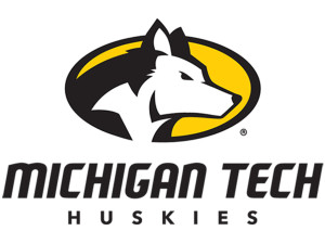
 HOUGHTON, Mich.—After more than a year of research and input from Michigan Tech student-athletes, staff, alumni and friends, the University today revealed a new visual identity to represent its 14 varsity athletics programs. New spirit marks convey the qualities for which the Huskies stand — excellence, integrity, loyalty, passion, teamwork and tradition.
The new set of spirit marks includes a new dog head, type treatment and two levels of marks. It also includes a subtle update to the long-standing Huskies script, which stands the test of time.
“Feedback from our key stakeholders was the driving force behind this evolution,” said Michigan Tech Athletic Director Suzanne Sanregret. “Our student-athletes, fans and coaches—the people who wear our apparel and represent our teams in competition—shaped and approved our new visual identity. We want to show pride in who we are and where we’re from while recognizing the great traditions of our programs.”
Michigan Tech began exploring the possibilities of a new visual identity in 2014, and the result is a visual identity pyramid with a number of different marks to meet various needs for space and context.
The primary mark is a Husky head in an oval with the University name in a custom font. The secondary palate, which may also be used on its own, includes several different type treatments with the custom font as well as a pair of circular marks—one of which incorporates an outline of the Upper Peninsula.
A third palate, used in association with either a primary or secondary mark, includes an outline of the Upper Peninsula, the Husky head by itself, an “MTU” acronym and the Huskies script.
The script has deep roots with Michigan Tech athletics, particularly with the hockey program, which wore the design on its jerseys while winning NCAA Championships in 1962, 1965 and 1975.
“Our new system gives teams variety and flexibility to represent Michigan Tech and keep our brand consistent in any situation or application,” added Sanregret.
The creative team behind the design was Michigan Tech’s University Marketing and Communications department, headed by Ian Repp, who was involved in several marketing initiatives in professional sports prior to joining Tech. “The new look for Michigan Tech athletics honors our proud history as Huskies with a fiercely determined look to the future. We are excited to have this identity serve as the face of Michigan Tech Athletics.” said Repp.
On February 26, Michigan Tech announced a University-wide branding initiative and unveiled a new logo that will be used along with a new message platform by the bulk of campus. The spirit marks revealed today are exclusive to Michigan Tech Athletics and Recreation.
“We recognized early on in our research the need for two distinct visual identities. Each serve a different purpose and both are critical tools in marketing the University to a diverse audience,” Repp added.
Tech’s new spirit marks will be implemented right away. A celebration event is planned when students begin arriving on campus next fall.

 Keweenaw Report Your Source for Local News and Sports


